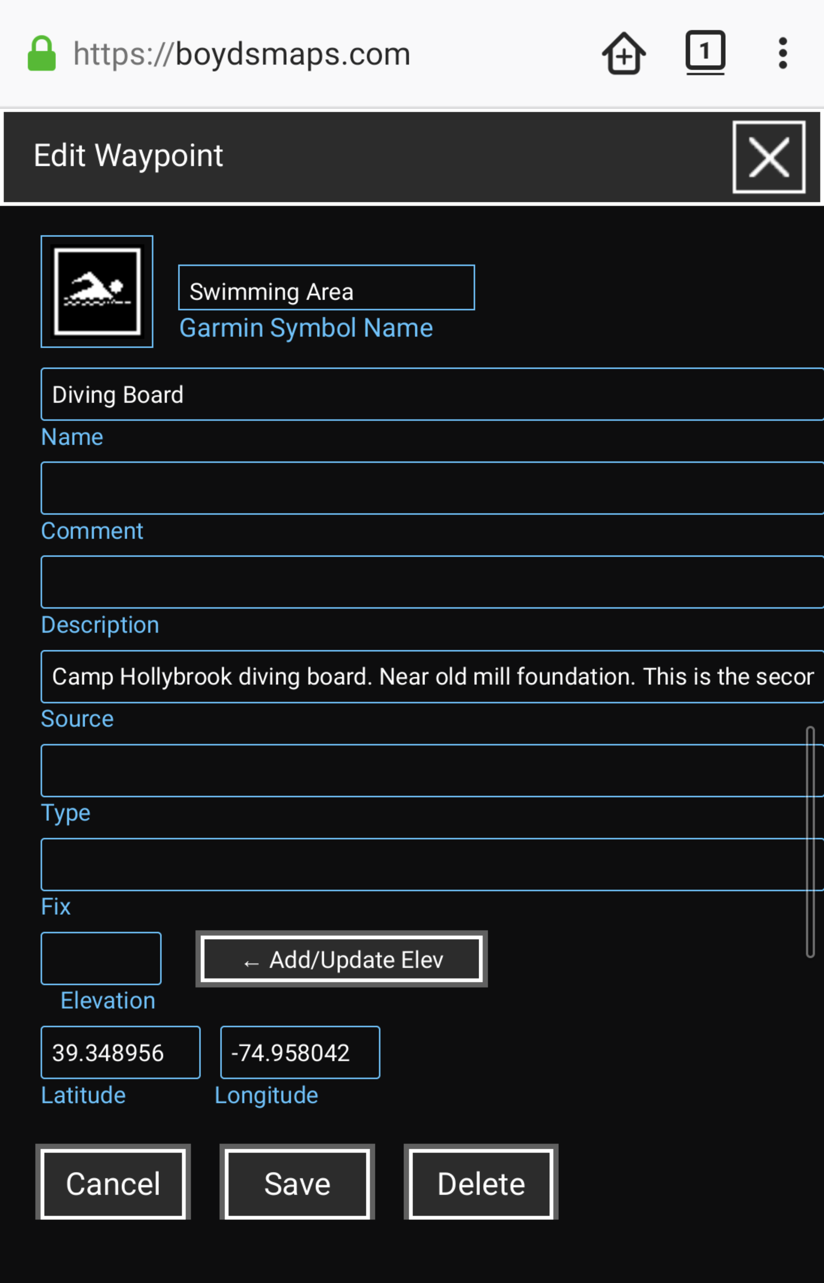
I probably should have said "text overflow" or "multi-line input" rather than word wrap, but these are all related concepts.
By default it looks like this - you use an
<input> field:
This is usually fine, but for long descriptions with a lot of contextual information about a waypoint, the text is truncated and hard to get at on a mobile device. To access the rest of the text, since there is no scroll bar, you have to either select all of the text in the field and copy and paste it somewhere else (e.g a notes app), or you have to carefully select the text and horizontally scroll at the far edge of the screen to push the cursor along and see the rest. I tend to type up notes about waypoints on a desktop computer and then use the waypoints file on my phone in the field, which is when I encounter this.
One way of addressing it might be to instead use a
<textarea> element, which is natively multi-line, rather than
<input>. If you do that, it looks like this:
The text
wraps to a new line on a word boundary (thus, "word wrap"). This is a bit easier to use, since it should provide multiple lines and scrollbars regardless of your users' platform.
<textarea> is by no means the only way to accomplish this, it was just the simplest one I could think of. And if you don't really see this as an issue, that's fine as well. As I said, it's a minor thing.
I hope that makes sense.


