Finishing this up right now. Need to tweak the code a bit, do some more testing, but will probaby be putting the new version online later today. This could cause cache issues, so "heads up". Clearing your browser cache should fix these issues, here's an article with instructions for doing this on Macs and Windows computers. A phone can be more problematic, both Android and iOS have preference settings to delete website data but it takes a little digging to get to them. When I have this kind of problem, I just delete the app from my phone home screen and then re-install since that's pretty easy. To reinstall, just go to boydsmaps.com on your phone and use the instructions in the helpfile to re-install.
If you have customized the app with your own waypoints, created special favorite maps or set other preferences you would like to preserve, make sure you have a backup. You can use the backup/restore functions built into the app for this, they are covered in the helpfile. It just takes a few seconds to do a backup. Even if you don't think it's needed - better safe than sorry. You can do a backup and then just forget about it. But it will give you a way to salvage your data later if there are any problems.
What's New
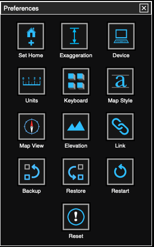
On the desktop version you will see three new items in the preferences menu - keyboard, map style and map view.
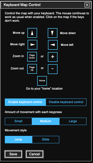
Keyboard control is something I've personally wanted for awhile. Nothing was built into the API for this, so I had to write it from scratch. It's disabled by default, so turn it on here. There are a few different options which you should just try for yourself and choose whatever you prefer. When enabled, you can sit back and "explore" the map using the function keys on your keyboard instead of driving a mouse around. These options are only available in the desktop version (since a keyboard is required). The mouse still works normally when keyboard control is enabled.
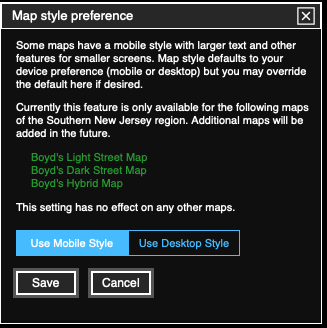
Normally, when you select either mobile or desktop mode, that will automatically select the style of my new maps. This preference allows you to over-ride the default and use the desktop version on your phone or mobile version on your computer if desired.
The map view preference is another thing I've personally wanted for some time, it sets the map view when the app first starts. In the past, the app defaulted to 3d view and I found myself tapping the compass every time I started the mobile app to lock it into 2d view with North at the top. This is especially helpful on a phone - I find it almost impossible to use "pinch and spread" zooming in 3d view without accidentally rotating the map. The new default mode is 2d which eliminates that problem. You can still switch to 3d mode at any time by just tapping the compass. And if you open a 3d link, it will automatically switch to 3d view even when you have the preference set to 2d.
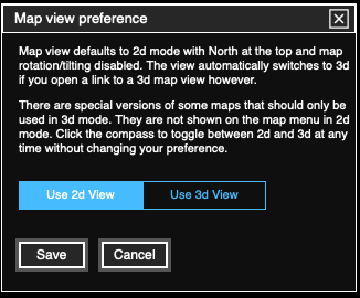
As discussed elsewhere, 3d maps use twice as much data, are slower to load and make your device work much harder. There's just no reason to use the 3d maps unless you're viewing them in 3d. In the pines where everything is so flat, there aren't all that many reasons to use 3d view. Aside from that, everytime you load a 3d map, it could create a billable event for me if my quota of free mapbox data is exceeded. I suggest you leave this preference set to the default of 2d, but if you have a good reason to change that, it can be done here.
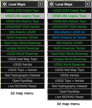
Here's how the menu is affected - the 3d maps are shown in blue. And this introduces another new feature: the maps shown in green are stored on the boydsmaps server and should load quickly and always be available. Just think "green is good" - you should be able to quickly "surf" the different green maps where maps that are stored on remote servers (such as the USGS or State of NJ) can sometimes be very slow or not available at all.
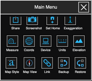
These new functions are available on the main menu in the mobile app, you may need to scroll the menu down to find them
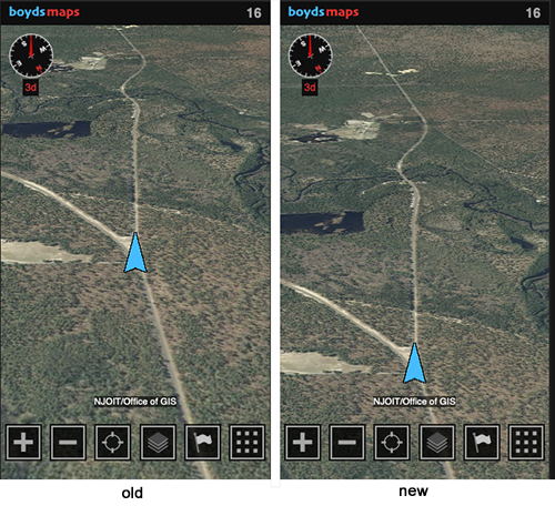
There's one more major update that only applies to the mobile version. If you are using the GPS in 3d view for a "track up" style display (where your direction of travel is at the top of the screen), the whole display will now shift down. This is another thing I've wanted to implement for awhile, and it's similar to the way a Garmin GPS works in track up mode. It shows more of the road ahead. The old version showed too much of where you've already been, this shows more of where you're going. This only happens when the GPS is activated.
There are more changes "under the hood", such as automatically replacing links to 3d maps with the 2d version if they aren't really 3d views. This all happens automatically and you aren't likely to even notice. But it should make the app faster and stop you from wasting data when there's no need to use a 3d map.
As I said, expect these changes to become active by the end of the day today (Thursday 2/29). Happy leap year!
If you have customized the app with your own waypoints, created special favorite maps or set other preferences you would like to preserve, make sure you have a backup. You can use the backup/restore functions built into the app for this, they are covered in the helpfile. It just takes a few seconds to do a backup. Even if you don't think it's needed - better safe than sorry. You can do a backup and then just forget about it. But it will give you a way to salvage your data later if there are any problems.
What's New
On the desktop version you will see three new items in the preferences menu - keyboard, map style and map view.
Keyboard control is something I've personally wanted for awhile. Nothing was built into the API for this, so I had to write it from scratch. It's disabled by default, so turn it on here. There are a few different options which you should just try for yourself and choose whatever you prefer. When enabled, you can sit back and "explore" the map using the function keys on your keyboard instead of driving a mouse around. These options are only available in the desktop version (since a keyboard is required). The mouse still works normally when keyboard control is enabled.
Normally, when you select either mobile or desktop mode, that will automatically select the style of my new maps. This preference allows you to over-ride the default and use the desktop version on your phone or mobile version on your computer if desired.
The map view preference is another thing I've personally wanted for some time, it sets the map view when the app first starts. In the past, the app defaulted to 3d view and I found myself tapping the compass every time I started the mobile app to lock it into 2d view with North at the top. This is especially helpful on a phone - I find it almost impossible to use "pinch and spread" zooming in 3d view without accidentally rotating the map. The new default mode is 2d which eliminates that problem. You can still switch to 3d mode at any time by just tapping the compass. And if you open a 3d link, it will automatically switch to 3d view even when you have the preference set to 2d.
As discussed elsewhere, 3d maps use twice as much data, are slower to load and make your device work much harder. There's just no reason to use the 3d maps unless you're viewing them in 3d. In the pines where everything is so flat, there aren't all that many reasons to use 3d view. Aside from that, everytime you load a 3d map, it could create a billable event for me if my quota of free mapbox data is exceeded. I suggest you leave this preference set to the default of 2d, but if you have a good reason to change that, it can be done here.
Here's how the menu is affected - the 3d maps are shown in blue. And this introduces another new feature: the maps shown in green are stored on the boydsmaps server and should load quickly and always be available. Just think "green is good" - you should be able to quickly "surf" the different green maps where maps that are stored on remote servers (such as the USGS or State of NJ) can sometimes be very slow or not available at all.
These new functions are available on the main menu in the mobile app, you may need to scroll the menu down to find them
There's one more major update that only applies to the mobile version. If you are using the GPS in 3d view for a "track up" style display (where your direction of travel is at the top of the screen), the whole display will now shift down. This is another thing I've wanted to implement for awhile, and it's similar to the way a Garmin GPS works in track up mode. It shows more of the road ahead. The old version showed too much of where you've already been, this shows more of where you're going. This only happens when the GPS is activated.
There are more changes "under the hood", such as automatically replacing links to 3d maps with the 2d version if they aren't really 3d views. This all happens automatically and you aren't likely to even notice. But it should make the app faster and stop you from wasting data when there's no need to use a 3d map.
As I said, expect these changes to become active by the end of the day today (Thursday 2/29). Happy leap year!

Last edited:

